
rückla
Interviewed and tested with financially conscious 30 to 45 year olds across the DACH region, then designed a banking and investing experience simple enough for low financial literacy users without dumbing down the product.


Project Name
rückla
Headquarters
Berlin, Germany
Industry
Fintech
Timeline
March - October 2024
Clickable Prototype
Your bank. To the future. Easy-to-use banking and multiple investment options in one stop.
Background
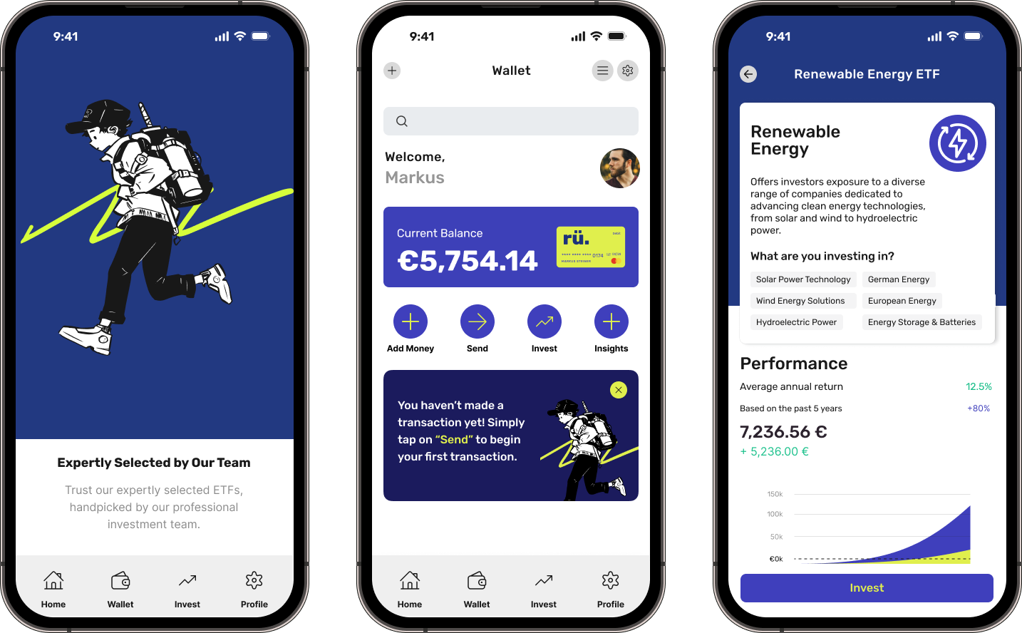
rueckla is a banking app concept designed to simplify everyday finances: transfers, savings with competitive interest, and ETF investing, all in one place. I built it as a self-directed case study to demonstrate a complete UX process, research, testing, and a high-fidelity prototype, outside the constraints of client work.
Key Problem
Many users need a way to manage their finances and investments seamlessly in one platform because juggling multiple accounts and investment platforms leads to daily confusion and wasted time. We'd know this to be true if we saw people migrate from multiple managed financial accounts to a single, holistic solution like rueckla, and report real improvements in how they manage their money and security.
Whom does it impact
rueckla's key market is financially conscious individuals with a professional background, aged 30 to 45, within the DACH region. They're financially conscious but have low to medium financial literacy. rueckla aims to offer a comprehensive financial solution that simplifies banking while providing accessible investment options for this group.
Design Needs
Users prefer an intuitive, user-friendly interface that integrates essential banking services with additional features like investment management (purchasing ETFs, savings plans, and other planned features), helping them make informed financial decisions without needing extensive expertise.
Key Research Insights
Insight #1: demand for enhanced banking app features
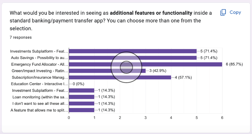
Users overwhelmingly want more from their bank apps than the basics: investing, budgeting tools, and an emergency savings fund.
Insight #2: users want educational resources and guided support for investing
There's significant interest in investment features within bank apps, but financial literacy on investing is generally low to medium. Users want educational resources and guided support so they can make informed decisions without feeling intimidated or scammed.
Insight #3: interface and specialized features drive platform choice
The interface and experience could be the main factor in choosing a banking platform for this age group. Traditional banks were criticized for complex navigation and limited digital functionality, plus concerns about automated customer service, trust, and security. Testers emphasized the need for intuitive UIs and responsive support.
Goals
rueckla directly addresses the target demographic's needs by streamlining the banking interface for ease of use regardless of technical expertise, and integrating diverse financial products into one comprehensive, one-stop app.
Design Process
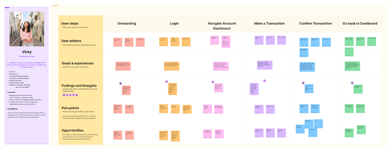
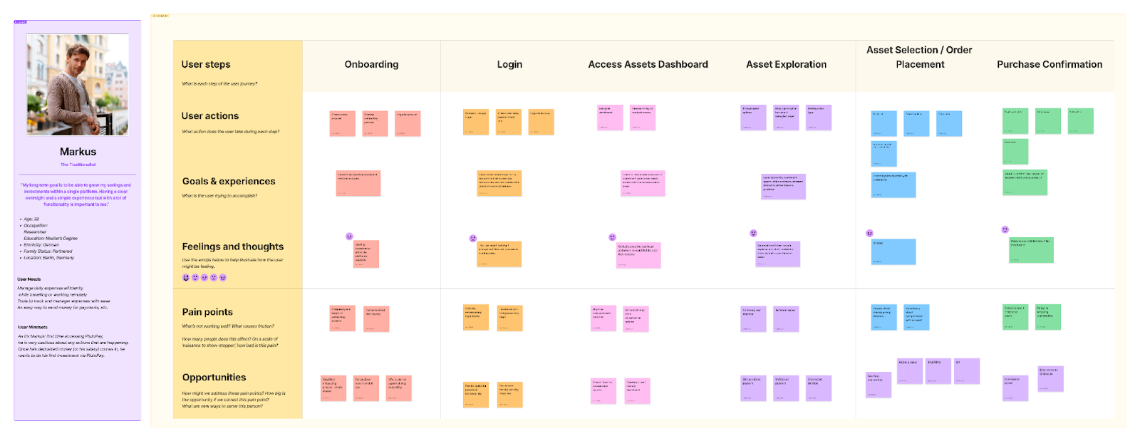
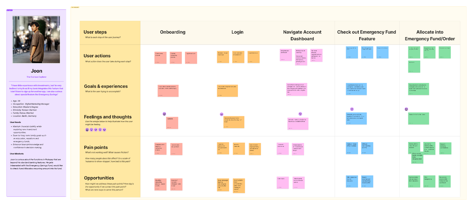
Conducted interviews, surveys, and focus groups with both users and bank stakeholders to understand their motivations, needs, and pain points around standard banking procedures, as well as their interest in other financial products.
Discovery and Research
Brainstorming sessions: explored potential solutions for banking and investment features, plus adjacent factors like cryptocurrencies, stocks, and reward systems.
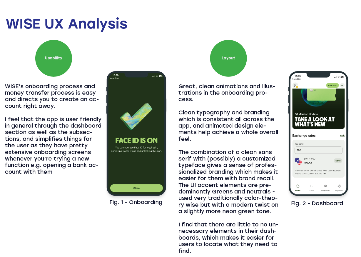
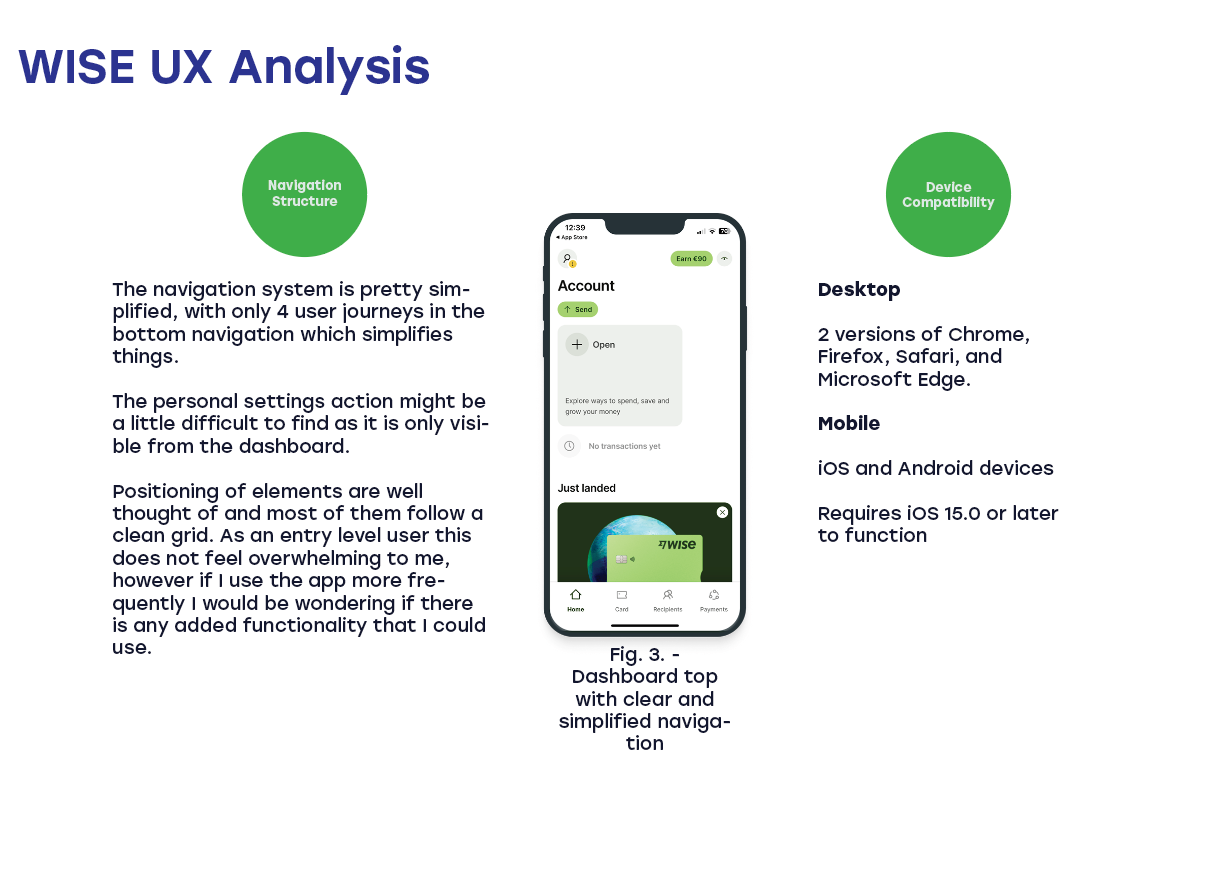
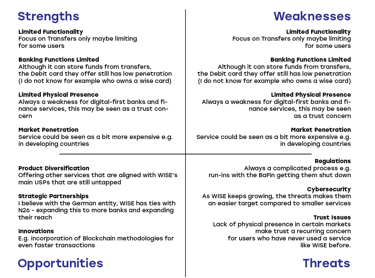
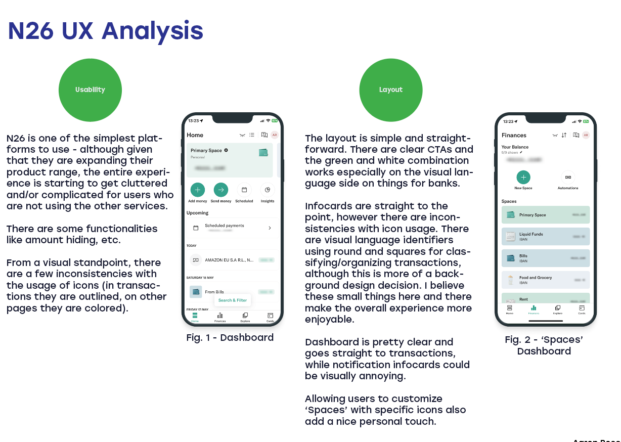
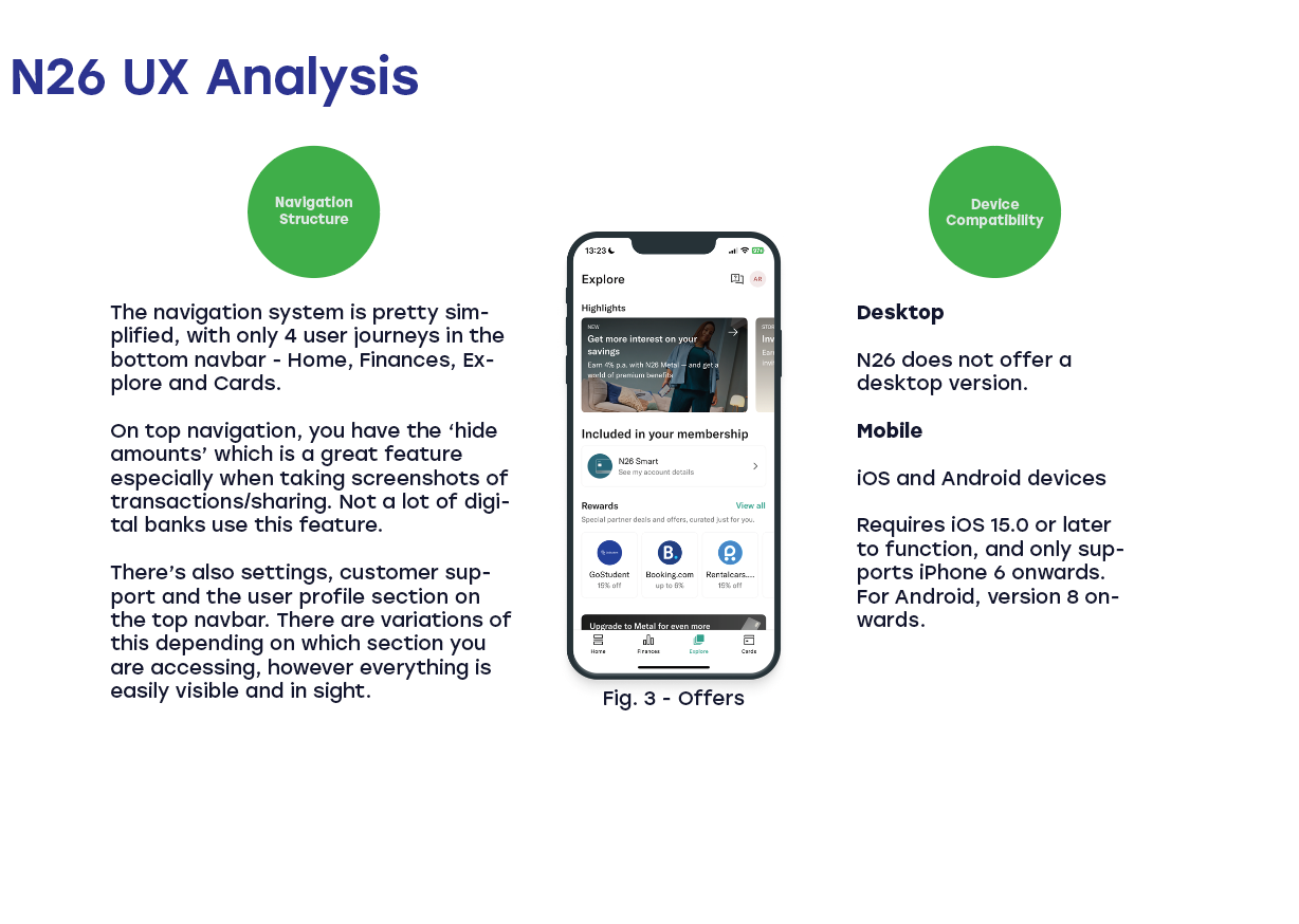
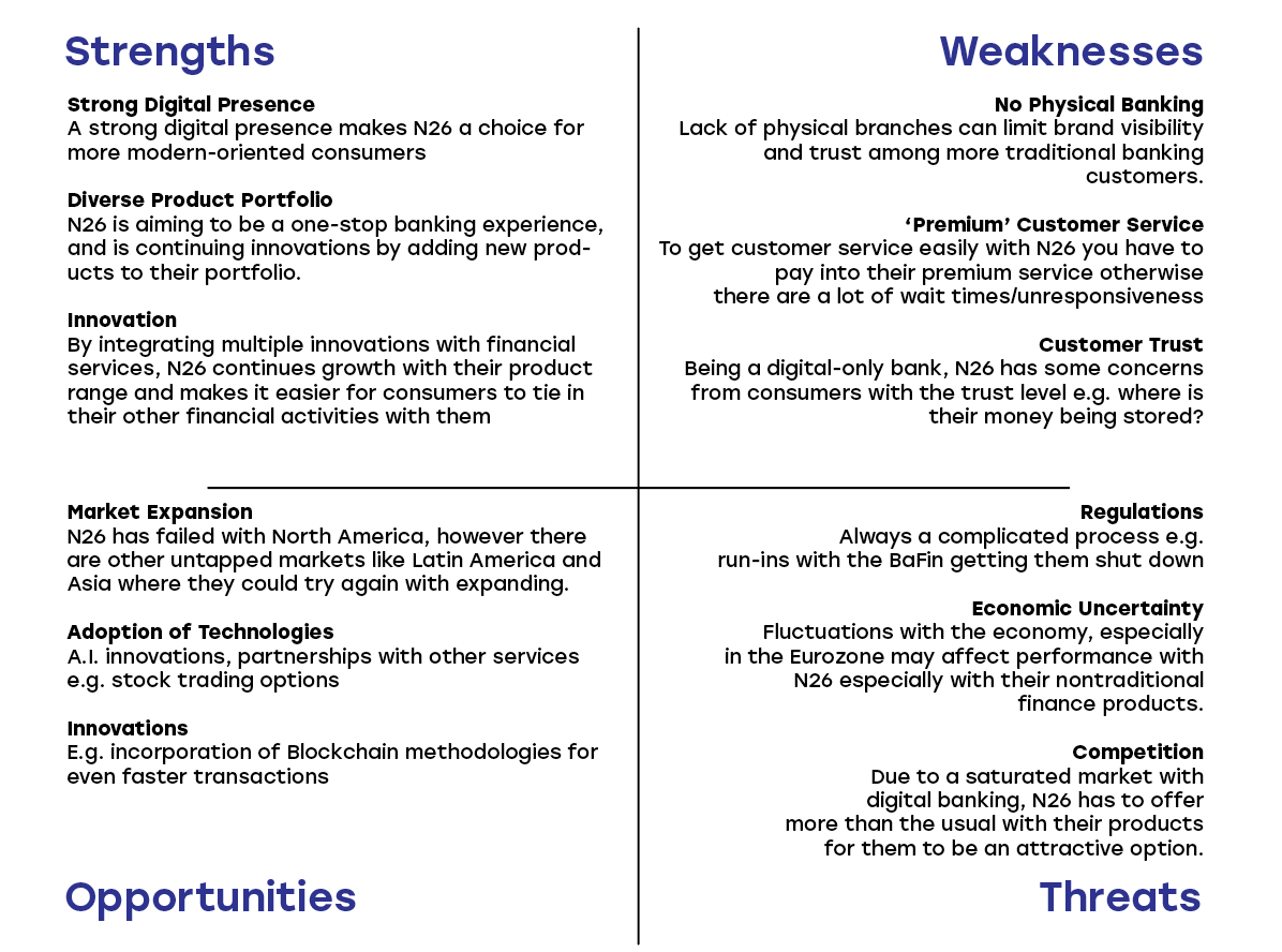
Competitor research:
User Surveys and Interviews
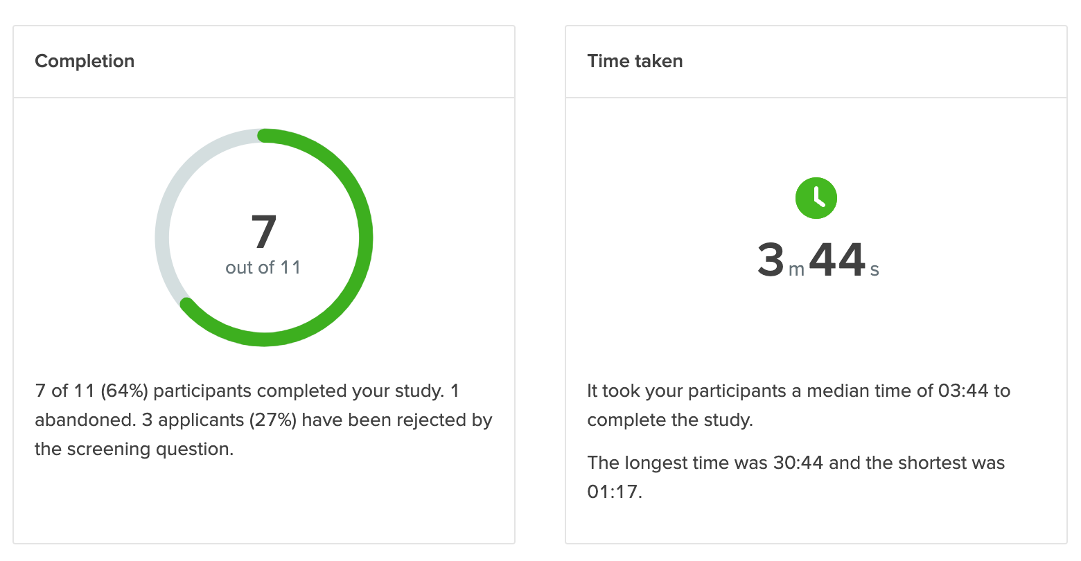
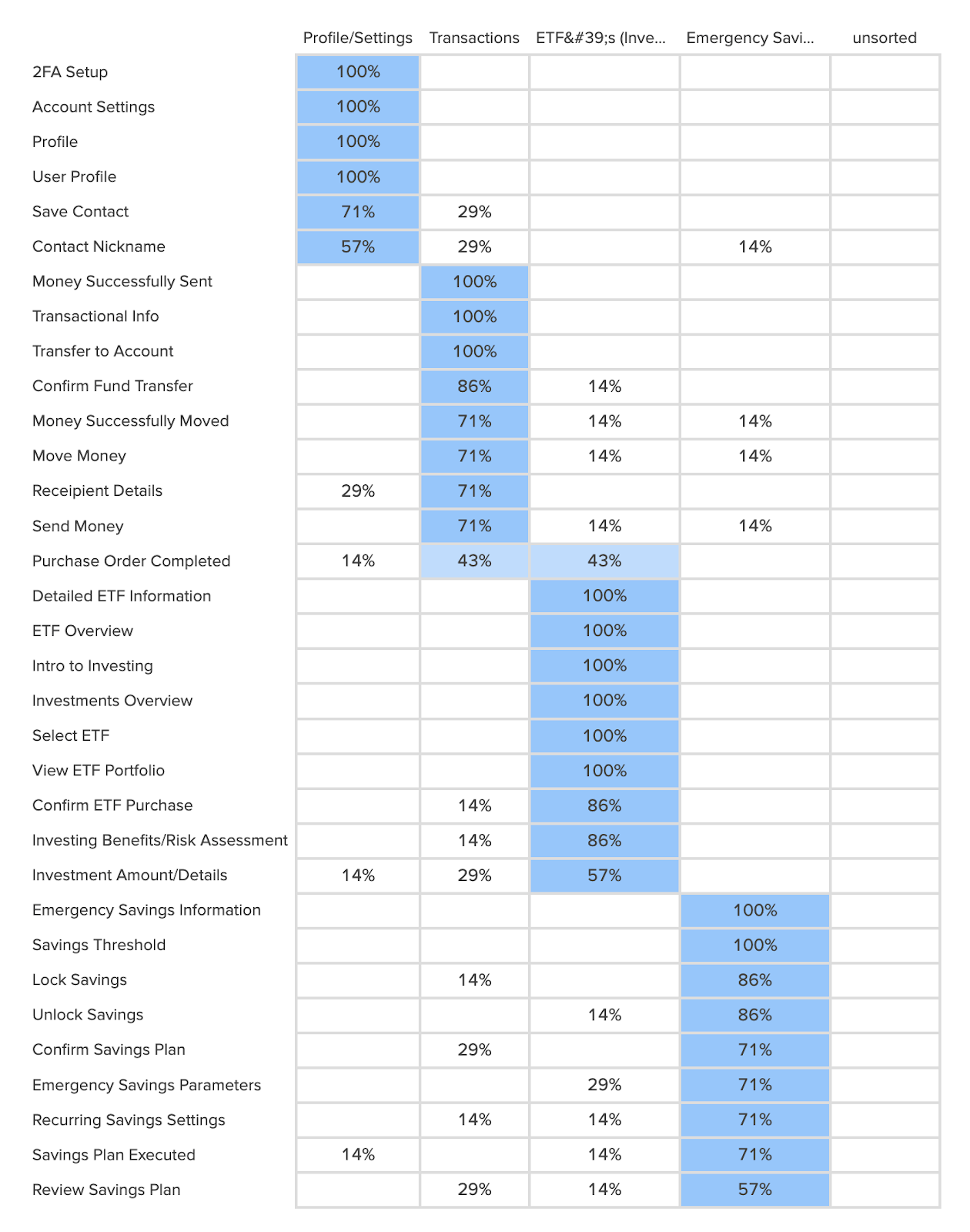
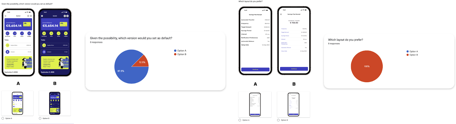
Feature viability survey and closed card sort: given limited resources and the geographic and age restrictions I wanted to apply, I used a closed card sort as the fastest way to gather feedback on the proposed flow, though it meant fewer qualifying respondents.
User Interviews
Demand for enhanced bank app features: users want more than the basics: investing, budgeting tools, an emergency savings fund.
Investment integration and financial literacy: strong interest in investment features, paired with low to medium financial literacy, meaning a clear demand for accessible, user-friendly investment options.
Trust vs. convenience: users balance trust in traditional banks against the convenience of digital ones.
Interface, service, and specialized features: traditional banks were criticized for complex navigation, limited digital functionality, and impersonal customer service. Users emphasized the need for intuitive UIs and responsive support.
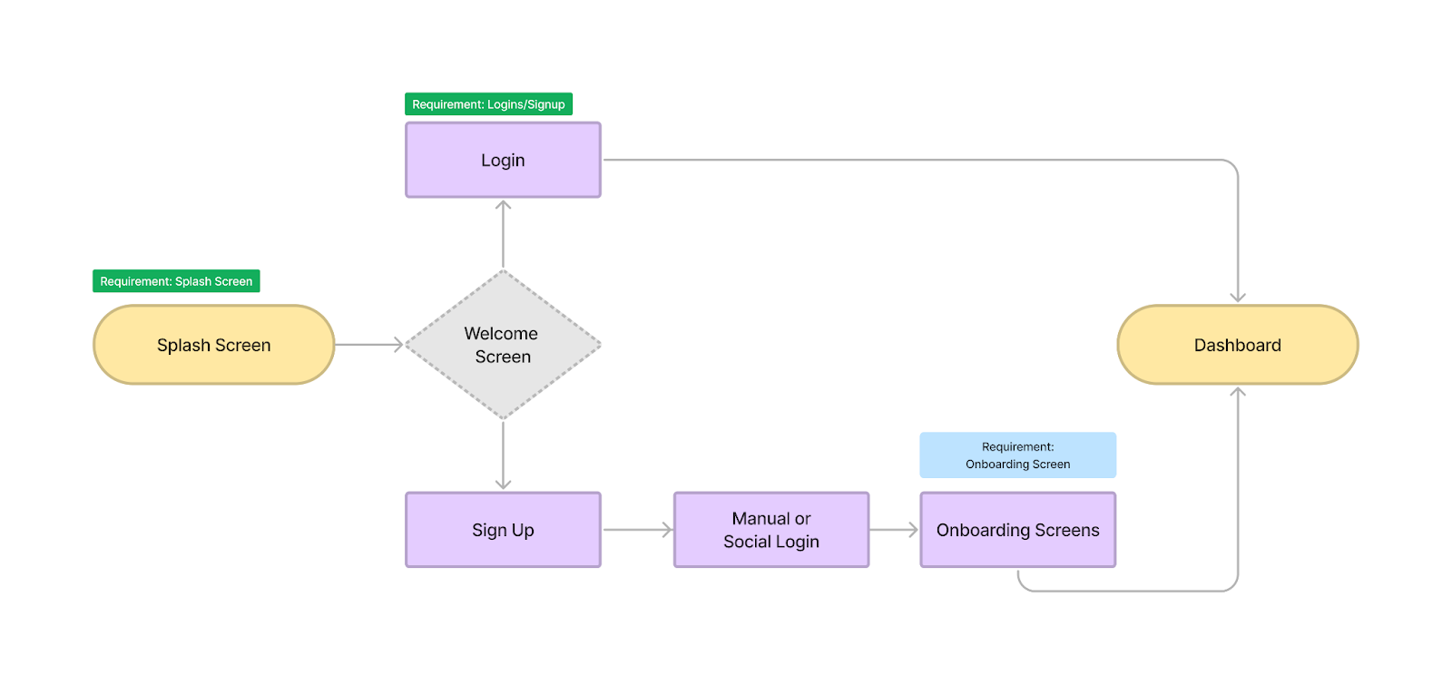
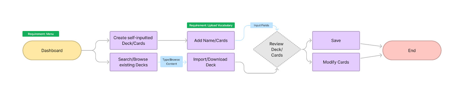

Design and Prototyping
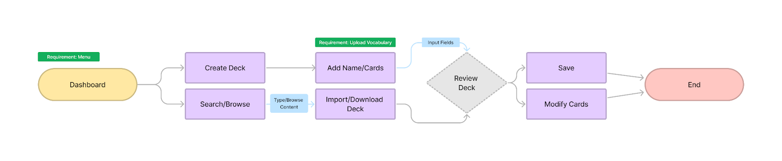
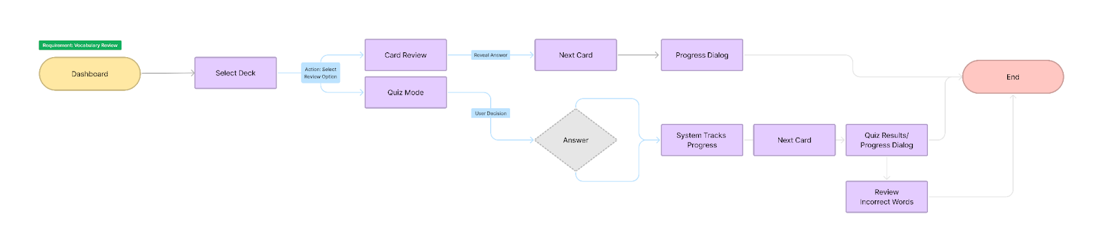
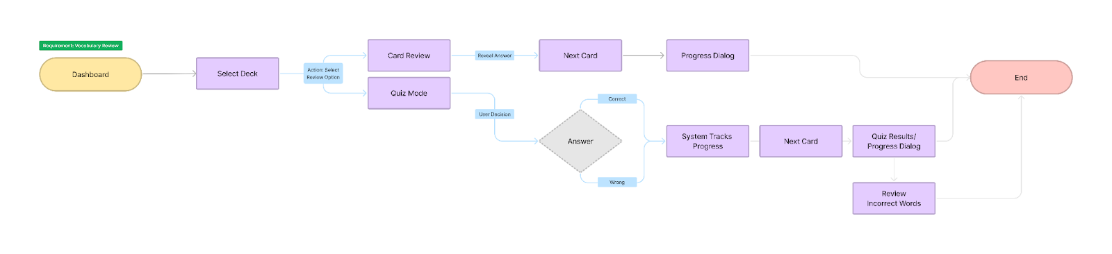
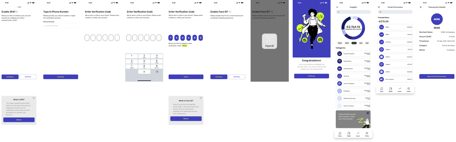
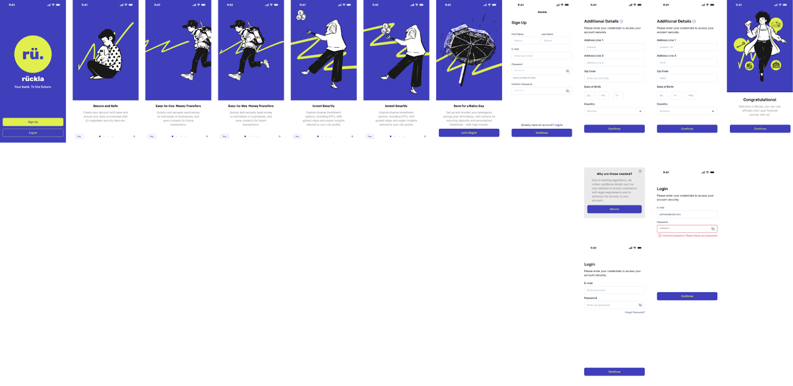
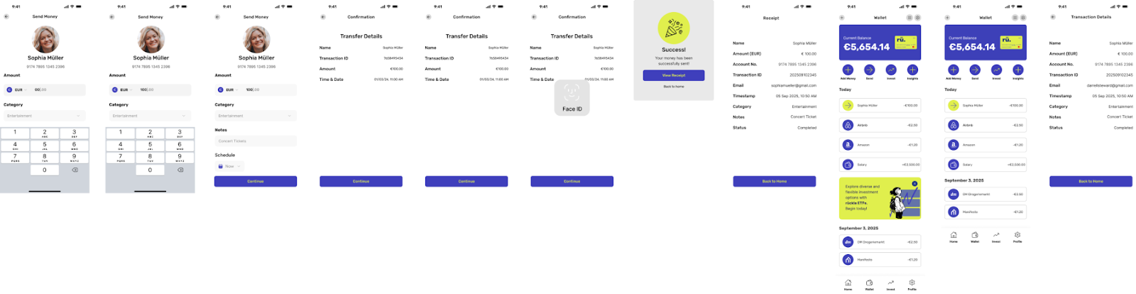
Created high-fidelity mockups aligned with rueckla's brand direction, along with a clickable prototype for user testing.
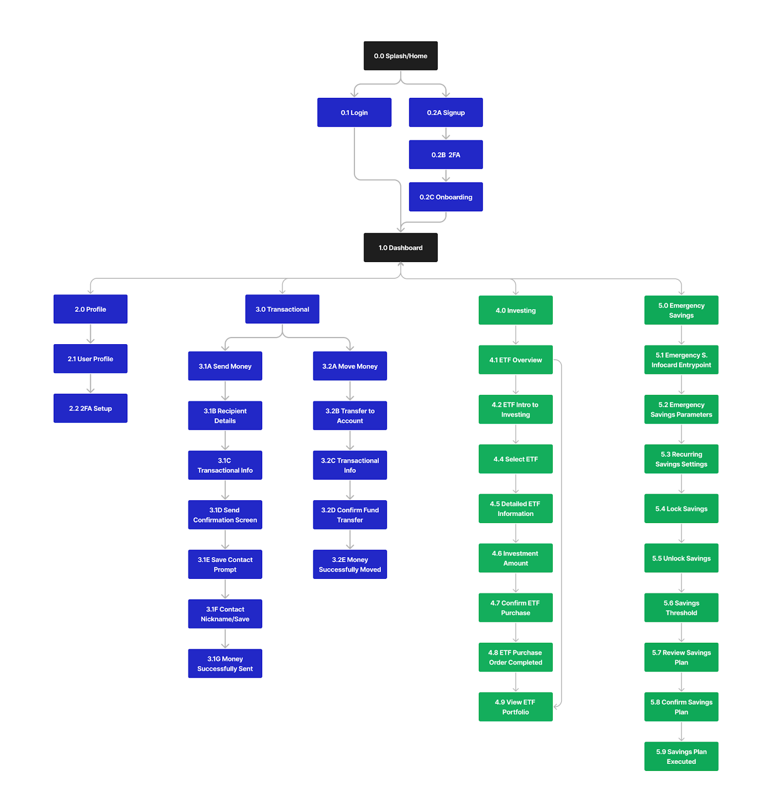
Sitemap
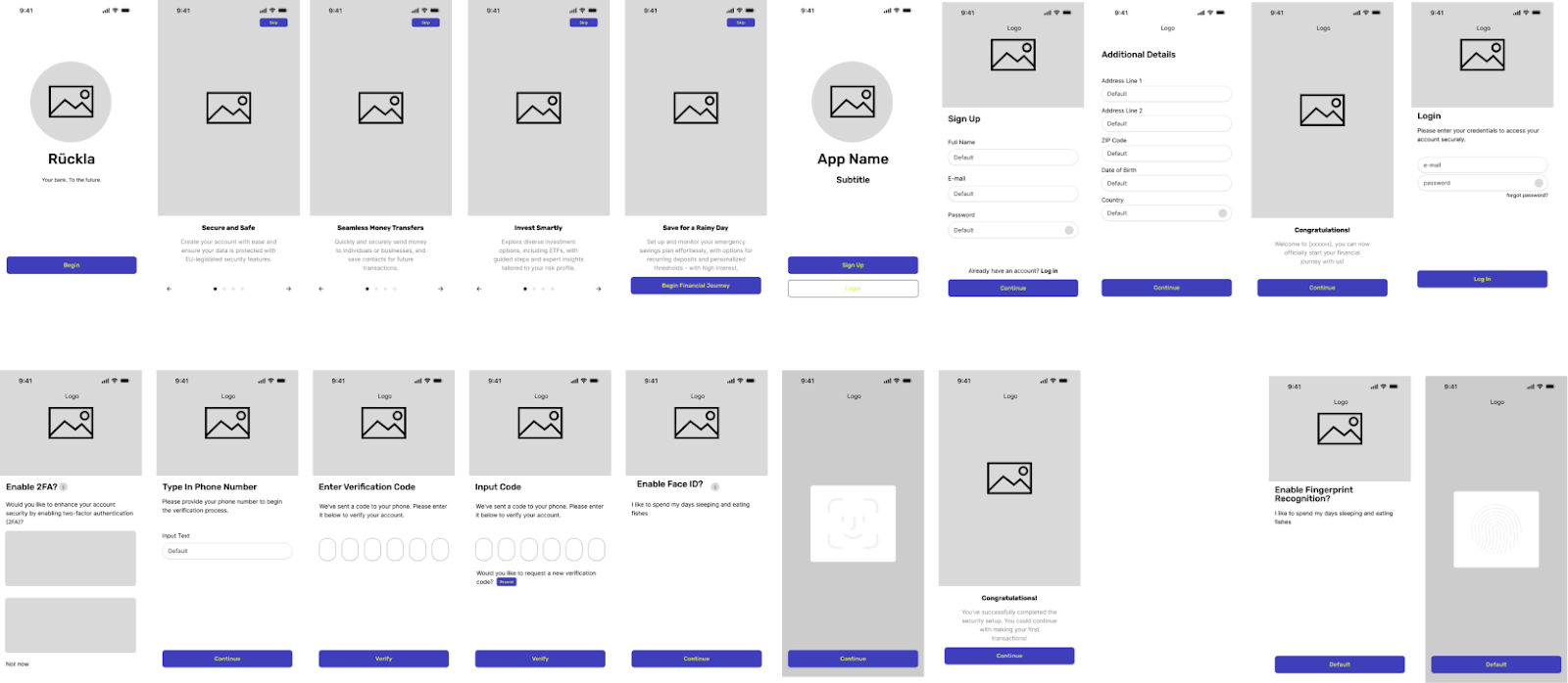
Wireframes, lo-fi to hi-fi
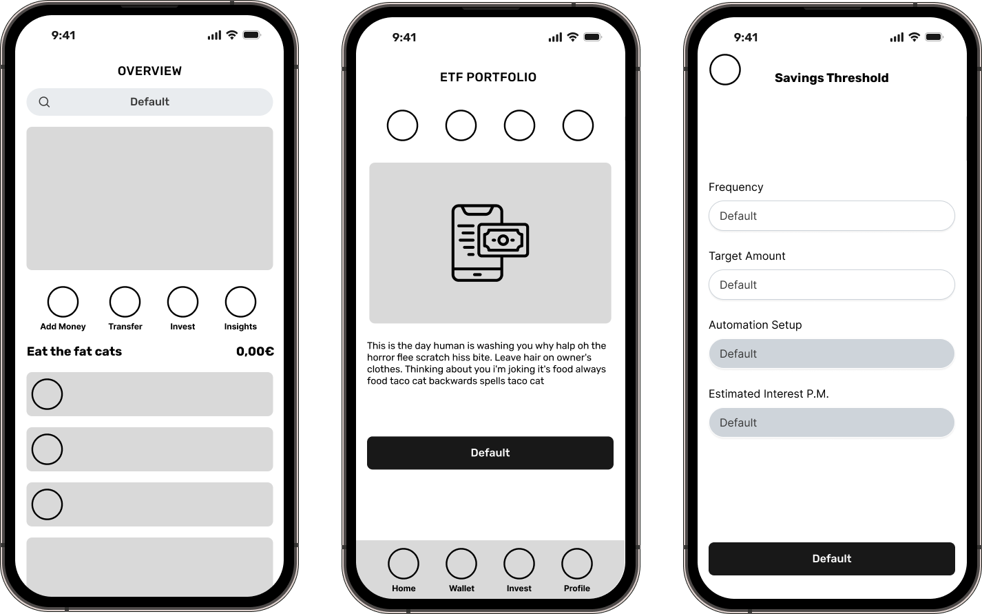
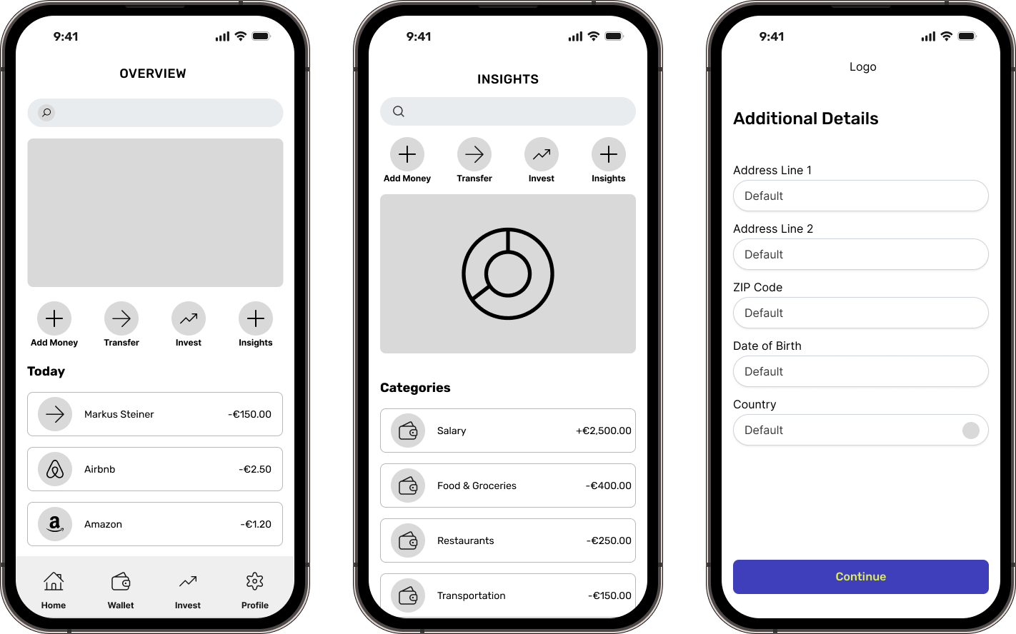
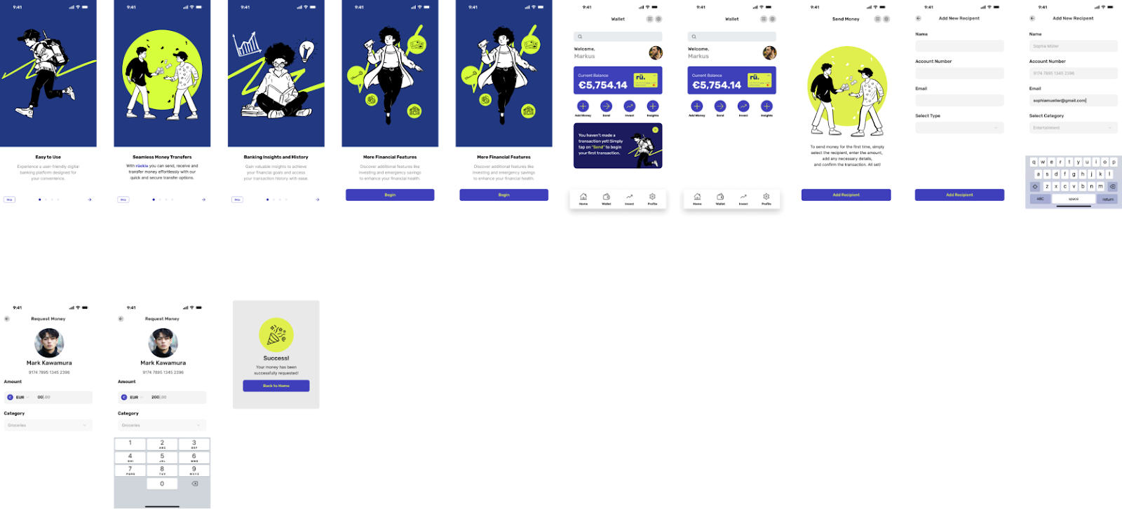
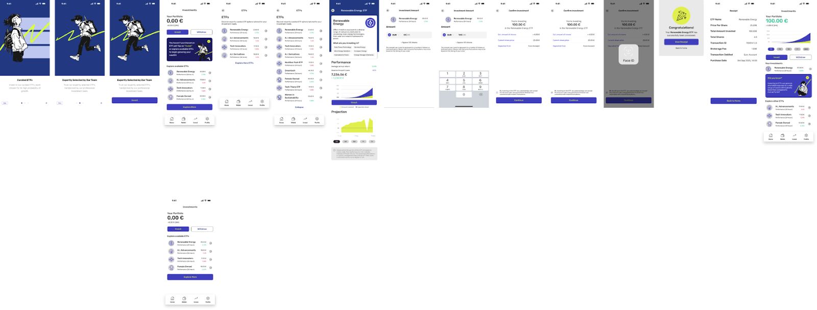
Prototype screens (hi-fi)
User Testing
Methodology: moderated in-person and remote testing.
Participants: aged 30 to 45, professional background, based in the EU, familiar with digital banking apps and with some exposure to wealth or investment services.
Schedule: sessions scheduled around participant availability via Calendly, completed within a one-week window.
Sessions: roughly 15 to 20 minutes each, with a few running longer at the participant's discretion. One session was conducted in person.
Metrics: alongside qualitative interview data, I used Nielsen's five components of usability to guide the revision phase.
General reception: participants praised the simplicity of the interface, the color scheme, and the illustrations. There was a clear positive response to the app's balance of simplicity and playfulness, a differentiator for an age group tired of traditional banking app interfaces.
Scenario feedback: sending money and ETF investing scored very high on satisfaction. The main pain points were a lack of supporting information and some overly invasive explanations of complex terminology for first-time investors.
Emergency savings plan: despite a positive overall reception, several users found the explanation of this feature confusing, pointing to a need for clearer communication and possibly a redesign of how the information is presented.
Prototype feedback: some participants expected to tap through every function rather than being guided to the action point, likely due to limited familiarity with prototype testing.
Consistent patterns: repeated comments made prioritizing revisions easier, mostly around type size, positioning, and sizing of design elements.
Varying financial literacy: even among mostly tech-sector participants, exposure to investment products varied widely, reinforcing the need for more UX writing and in-context education rather than purely visual changes.
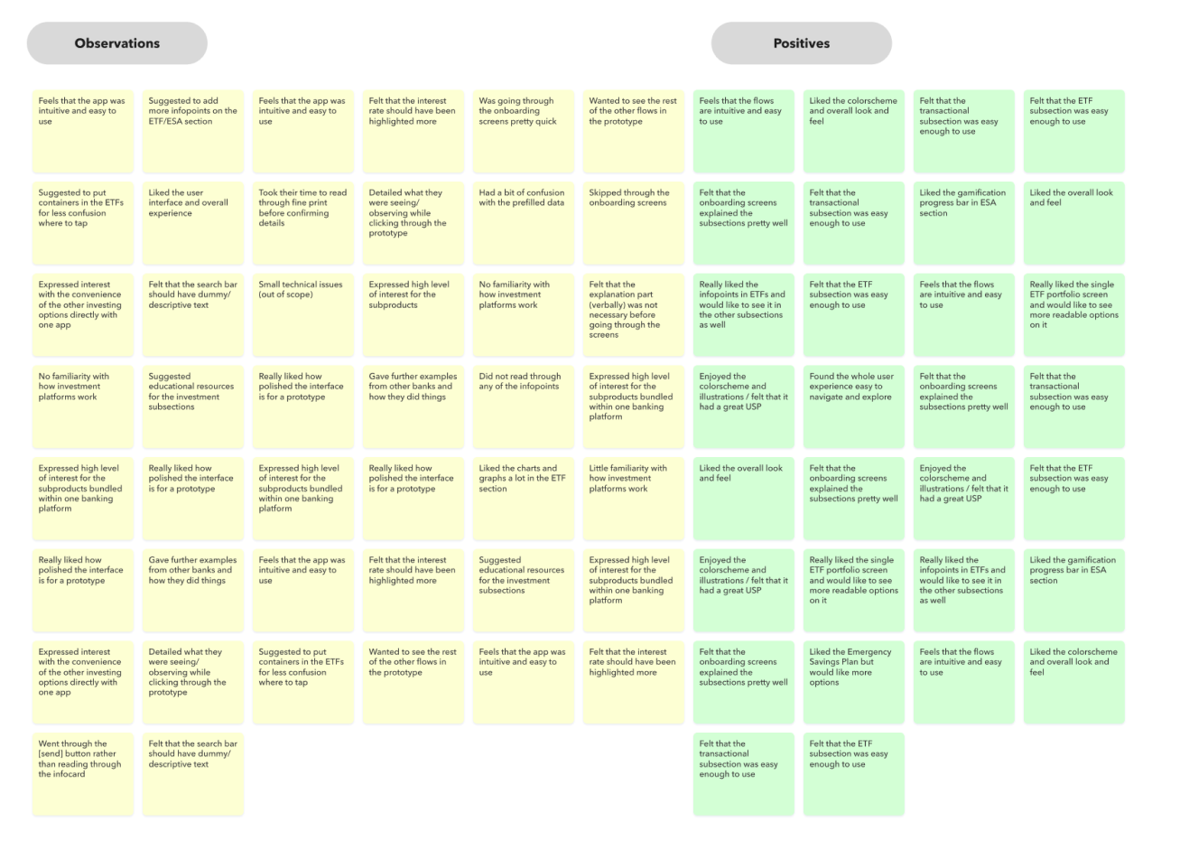
Affinity maps: used affinity mapping to group user test results into common themes for easier analysis.
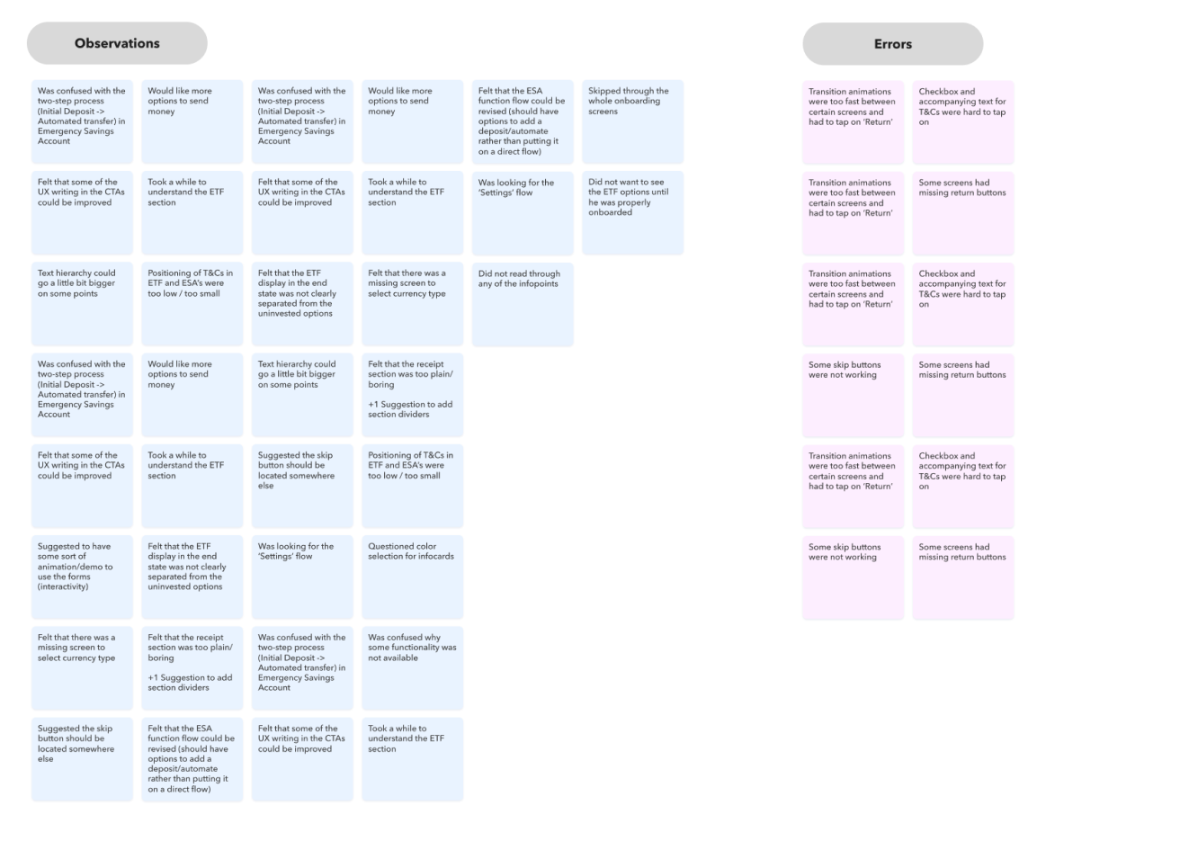
Revision prioritization: compiled the data and rated issue severity using the Nielsen rating system to prioritize the redesign.
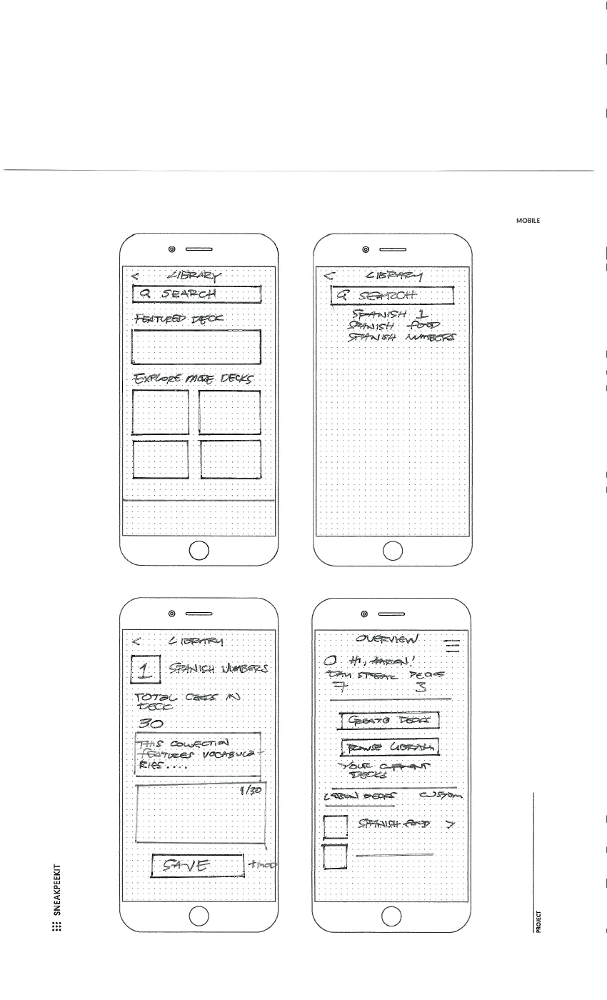
Early-Stage Concepts
Design Solutions
Generating user-driven impact via improvements in rueckla's suite:
Insight #1, enhanced banking app features. Benefit: a user-friendly interface with personalized financial tools and investment options like ETF purchase and management and interest-earning savings accounts. Value: greater control and convenience, leading to higher engagement and satisfaction.
Insight #2, investment integration and financial literacy. Benefit: a tiered learning system with guided investment support. Value: helps users build confidence and competence in investing without feeling overwhelmed, increasing adoption of investment features.
Insight #3, interface, service, and specialized features. Benefit: an intuitive, mobile-first design with hybrid customer support. Value: better navigation, more responsive service, and clearer communication of specialized features, improving trust and loyalty.
Learnings
Enhanced feature demand: users want more financial tools: budgeting aids, investment options, and simplified transfers like QR codes.
Interest in financial education: strong interest in investment features paired with a need for accessible financial literacy resources.
Interface and support concerns: UI and support quality are critical to user satisfaction, with a strong emphasis on intuitive design.
Positive reception to the interface: rueckla's visual design and overall experience received strong positive feedback across every test.
USPs
Intuitive experience: a streamlined, easy-to-navigate interface for users of any experience level, with minimal learning curve.
Comprehensive investment options: diverse investment opportunities in a single platform, no need for multiple accounts or apps.
Commitment to transparency: clear, straightforward information about fees, investment options, and account features, to build trust and support informed decisions.
Tone
rueckla's personality is defined by hyper-modern illustration and visuals, evoking a futuristic vision of banking: a bank to the future. The imagery and color choices lean forward-thinking while incorporating traditional banking cues, like blue tones, to signal trust. The goal is an emotional connection with an audience that values being early to the next big thing in modern banking.
Values
User-centric innovation: designing solutions that genuinely address user needs and preferences, so every feature enhances the experience and simplifies people's lives.
Transparency and trust: building trust through clear communication, reliable service, and a strong focus on privacy and security.
Continuous learning and growth: valuing curiosity and continuous learning, both for the team and for users, through tools and resources that support personal and financial growth.
Other Projects
rückla
Self-directed case study: rueckla, a speculative digital banking app for intuitive financial management. Ran the full UX process end to end, research, testing, and a high-fidelity prototype, to demonstrate process depth outside client work.
ecolytiq
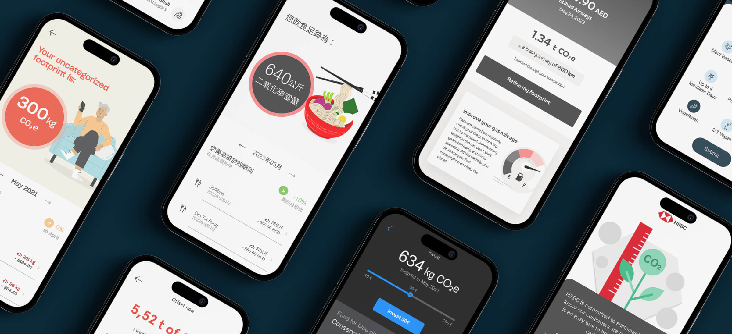
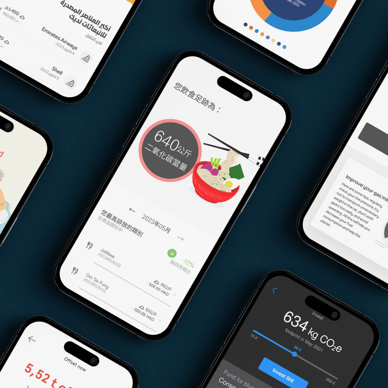
Sole senior UX designer for ecolytiq, a sustainability-as-a-service platform used by banking clients including HSBC and Mashreq, reaching 33 million consumers and helping avoid 520,000 tons of CO2e.