Protunes One (Design System)
Project Name
Protunes One Design System
Headquarters
Berlin, Dresden, Dublin
Industry
AI Music
Timeline
December 2024 - January 2026
ProTunes One is at the forefront of AI-driven music curation, serving a diverse user base from independent podcasters to global creative agencies. As the platform scaled, we faced a classic challenge: fragmented UI patterns and a widening gap between brand identity and product functionality. Given that there are multiple viewports as Protunes One is a webapp, it was important that the component sets were scalable
The Problem:
The existing interface struggled to keep pace with ProTunes’ rapid AI integration. We identified three core pain points:
- Visual Inconsistency: The marketing brand felt vibrant and cinematic, while the product dashboard felt clinical and disconnected.
- Development Friction: Engineers were rebuilding similar components (buttons, cards, search bars) from scratch for different modules, leading to code bloat.
- Complex AI Interactions: Standard UI kits didn't account for the nuances of semantic search, waveform visualization, or AI-generation loading states.
The Solution:
The Content:We adopted an Atomic Design methodology to ensure every element was purposeful and reusable. "One" wasn't just a UI kit; it was a living ecosystem.
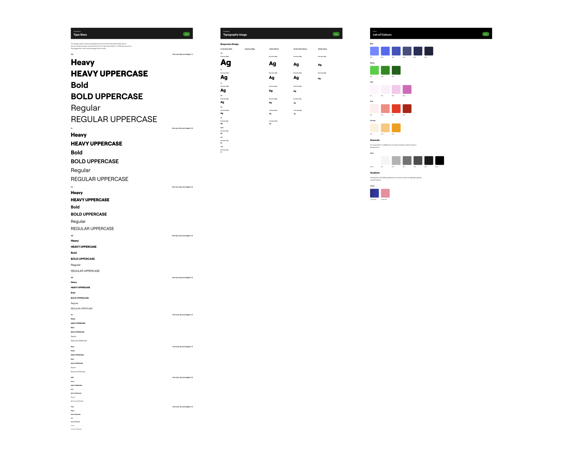
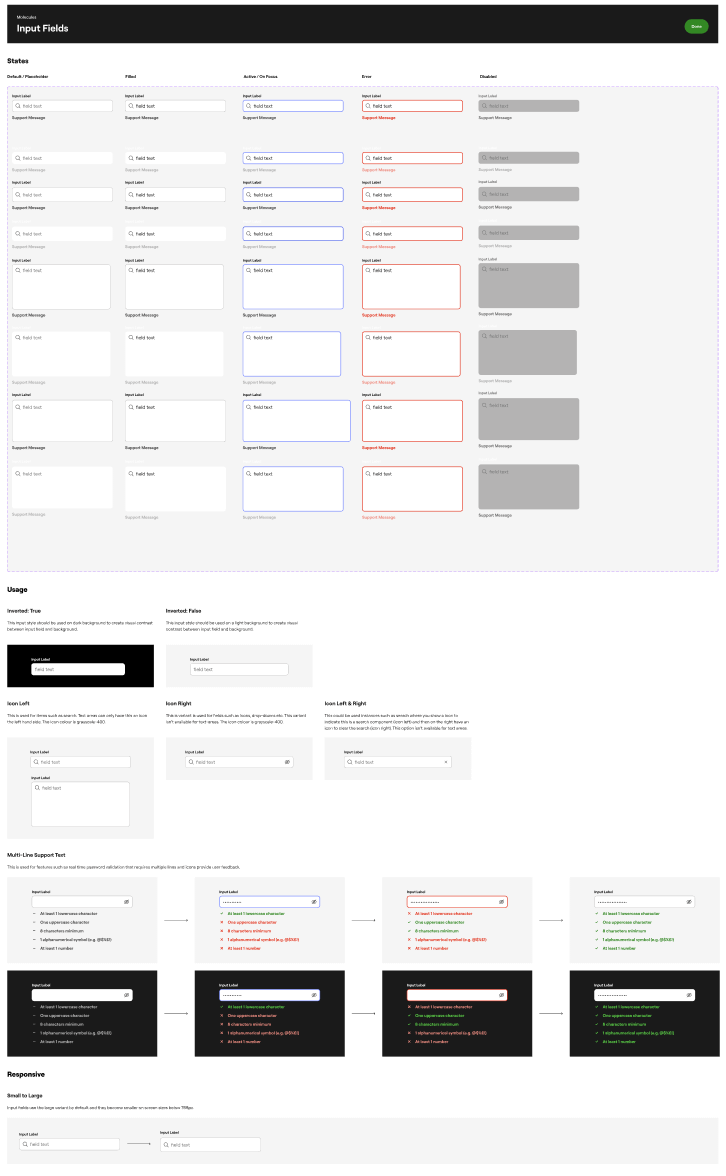
- Design Tokens: We established a robust token system for colors, spacing, and typography. This allowed us to maintain WCAG-compliant accessibility while keeping the high-energy aesthetic required for a music platform.
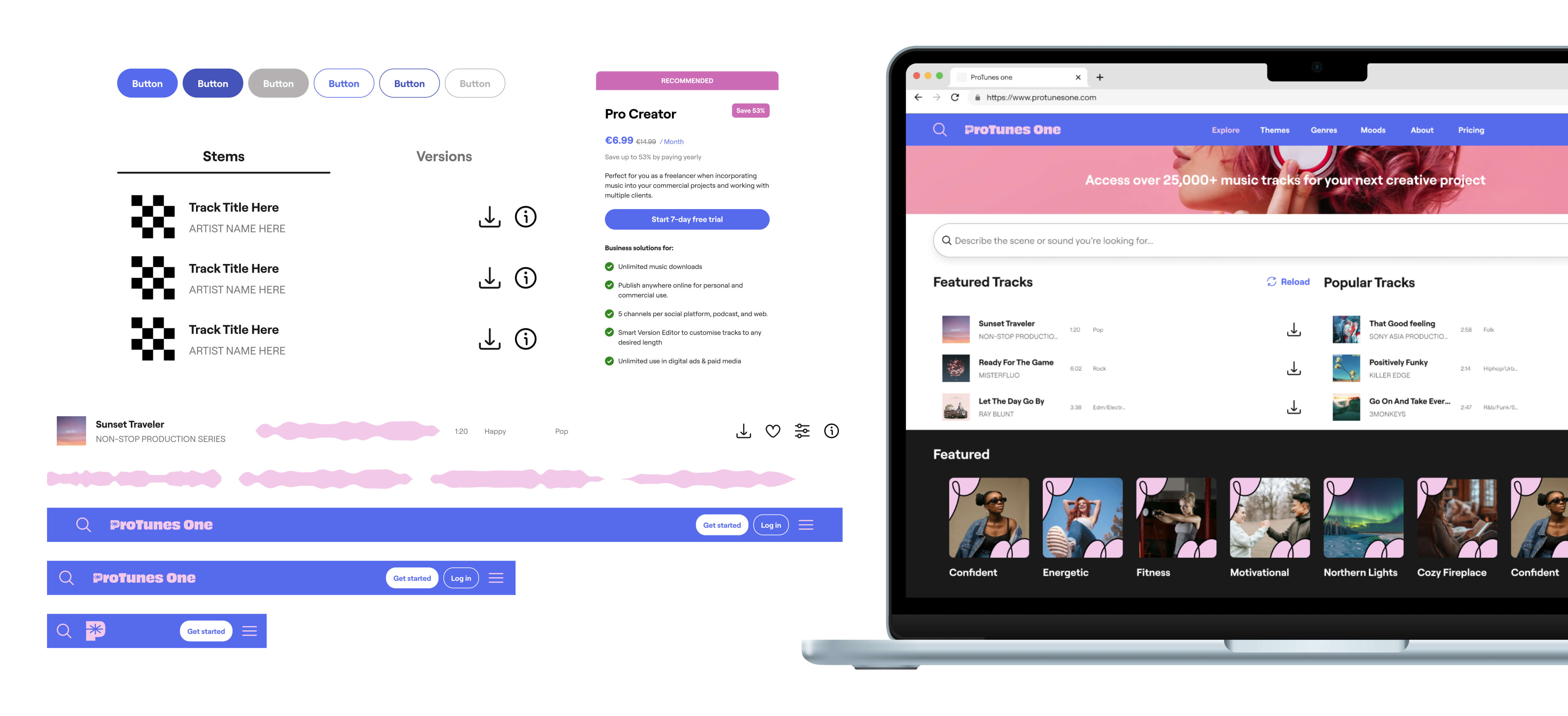
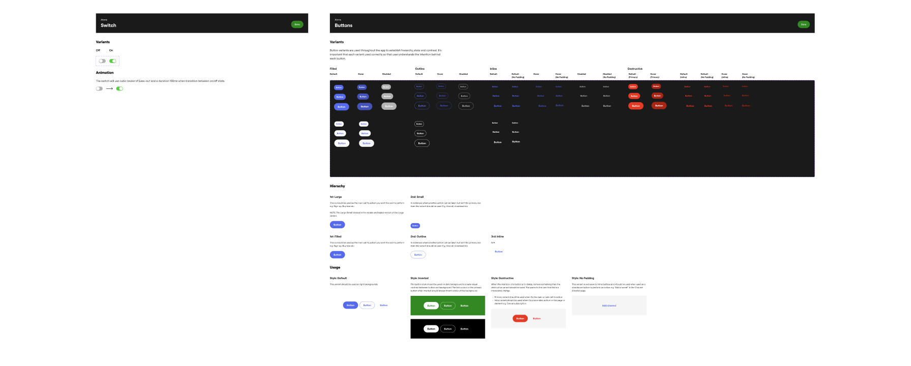
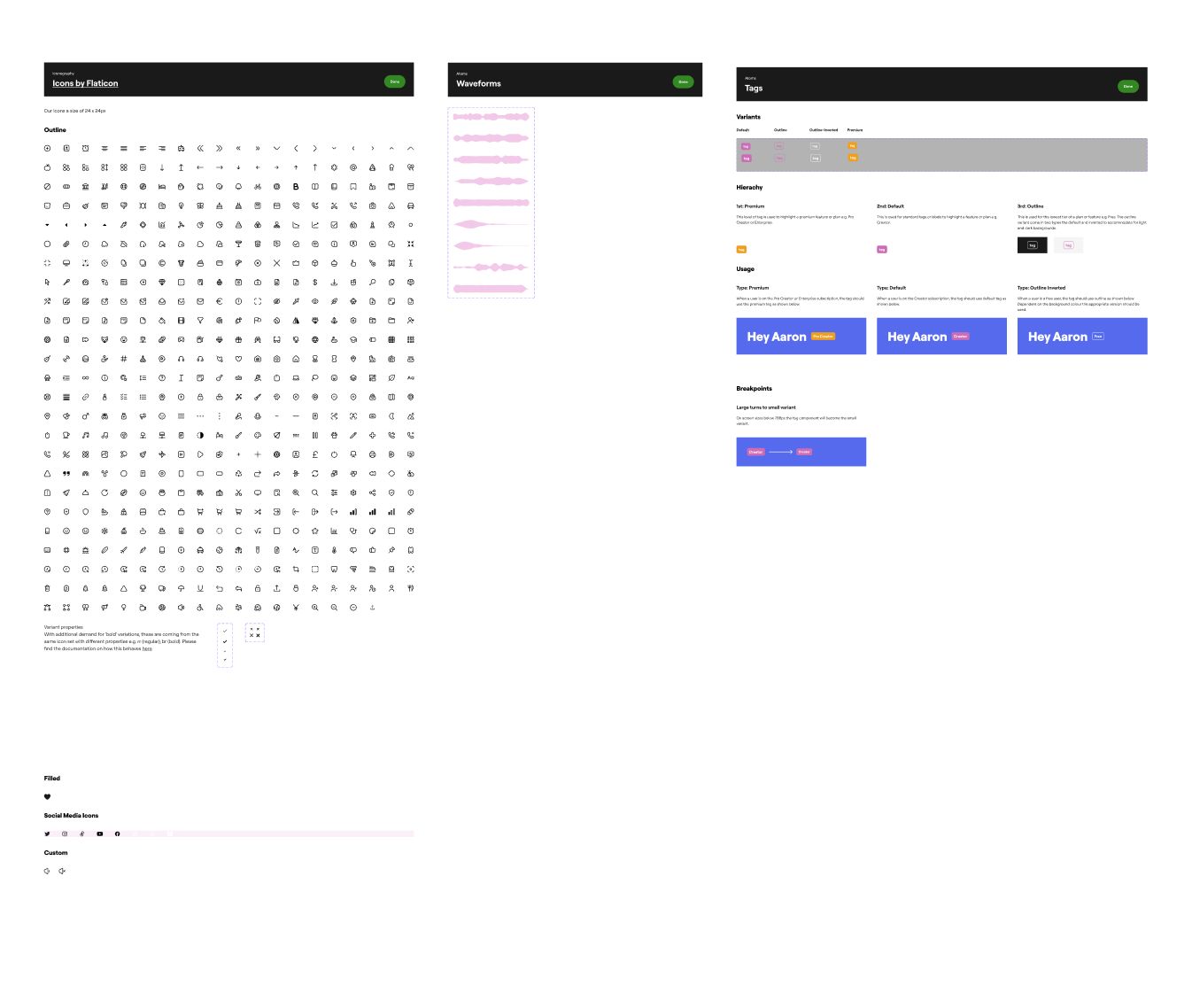
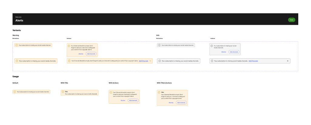
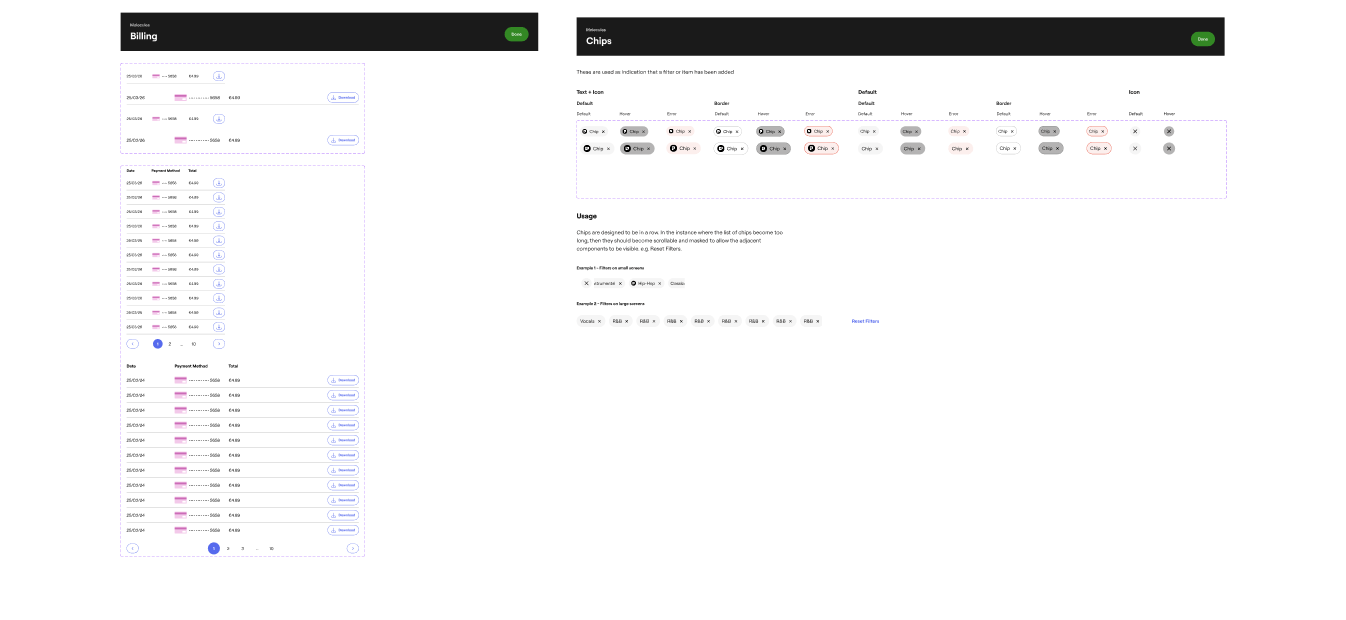
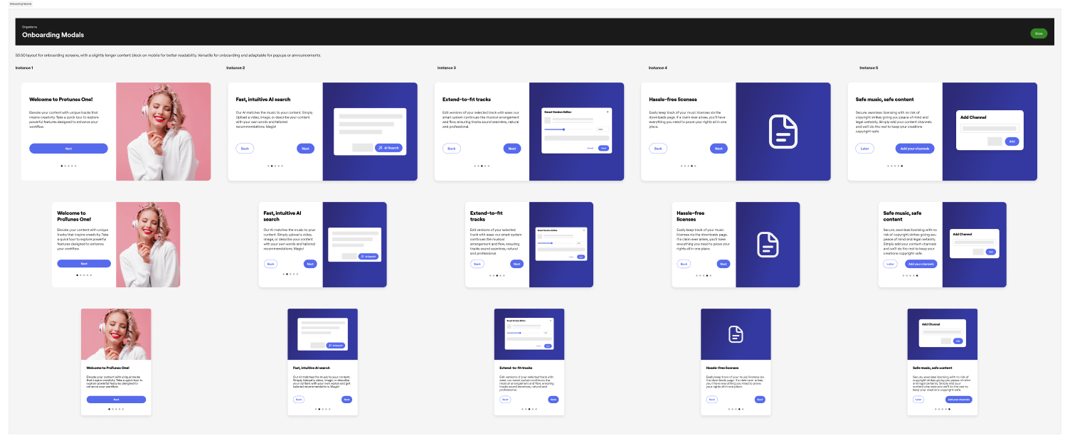
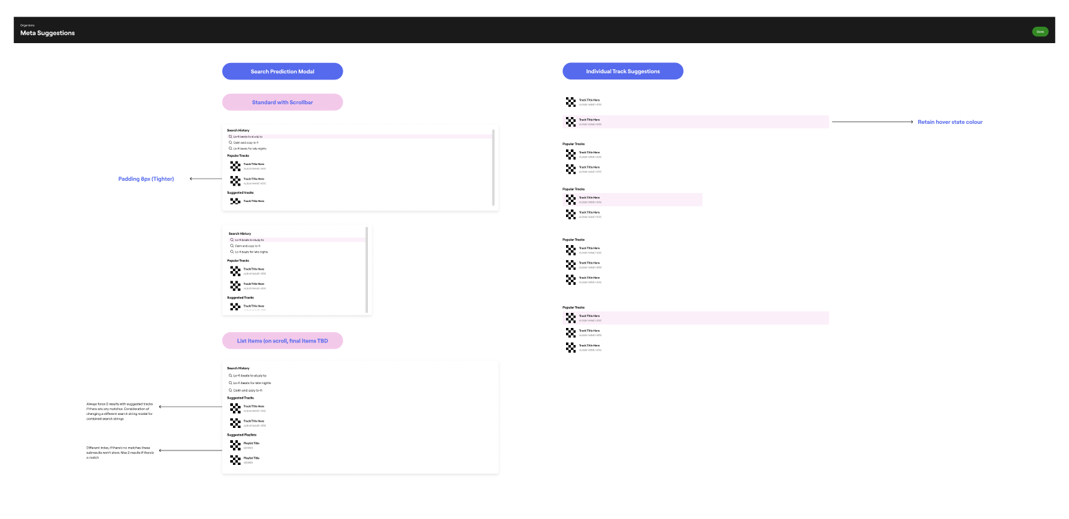
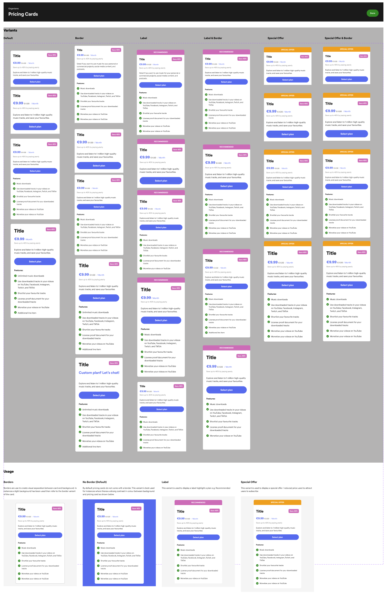
- The Component Library: I designed a library of 50+ modular components—from adaptive audio players to complex filtering systems—built with Figma’s latest "Variables" and "Auto Layout" features for maximum responsiveness.
- Documenting the Truth: Beyond the pixels, I established a "Source of Truth" documentation site, providing developers with clear guidelines on interaction states, motion principles, and API naming conventions.
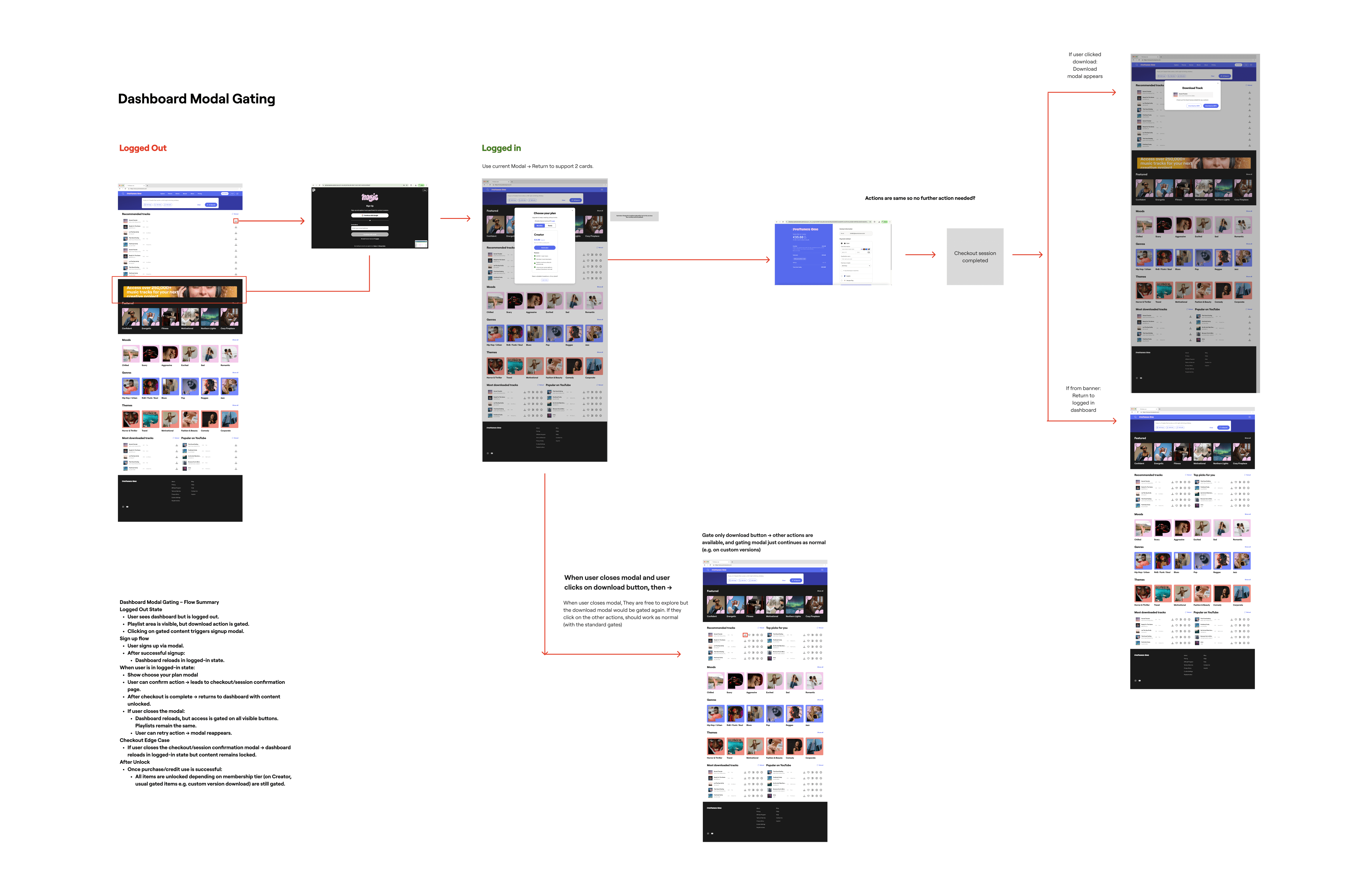
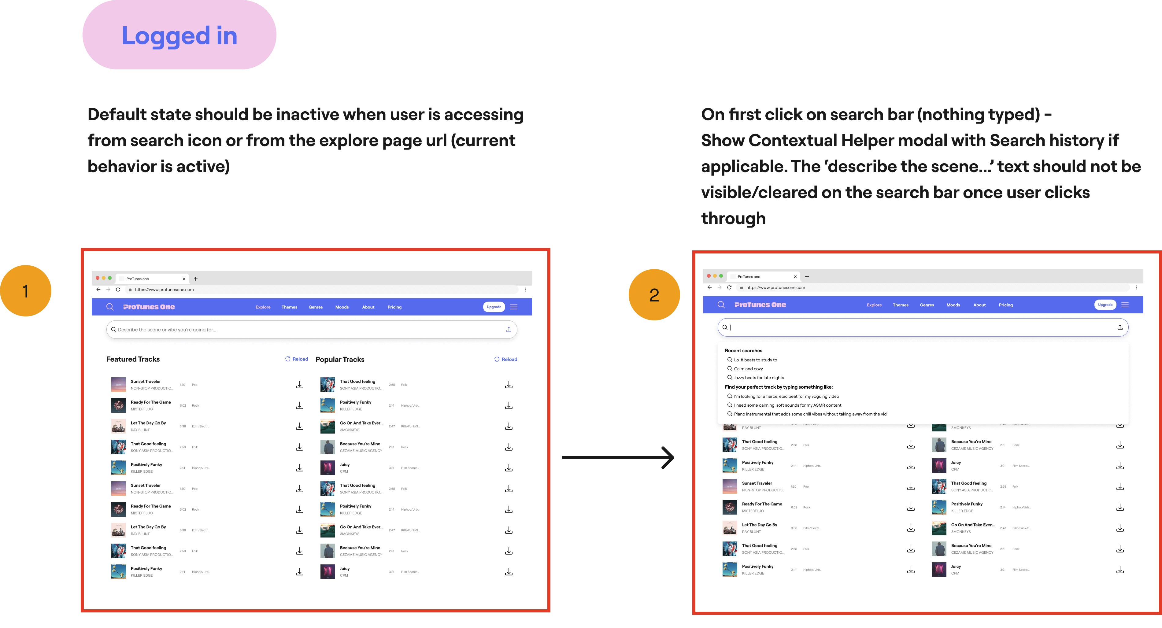
The Content:The unique challenge of ProTunes One was designing for AI-first interactions.
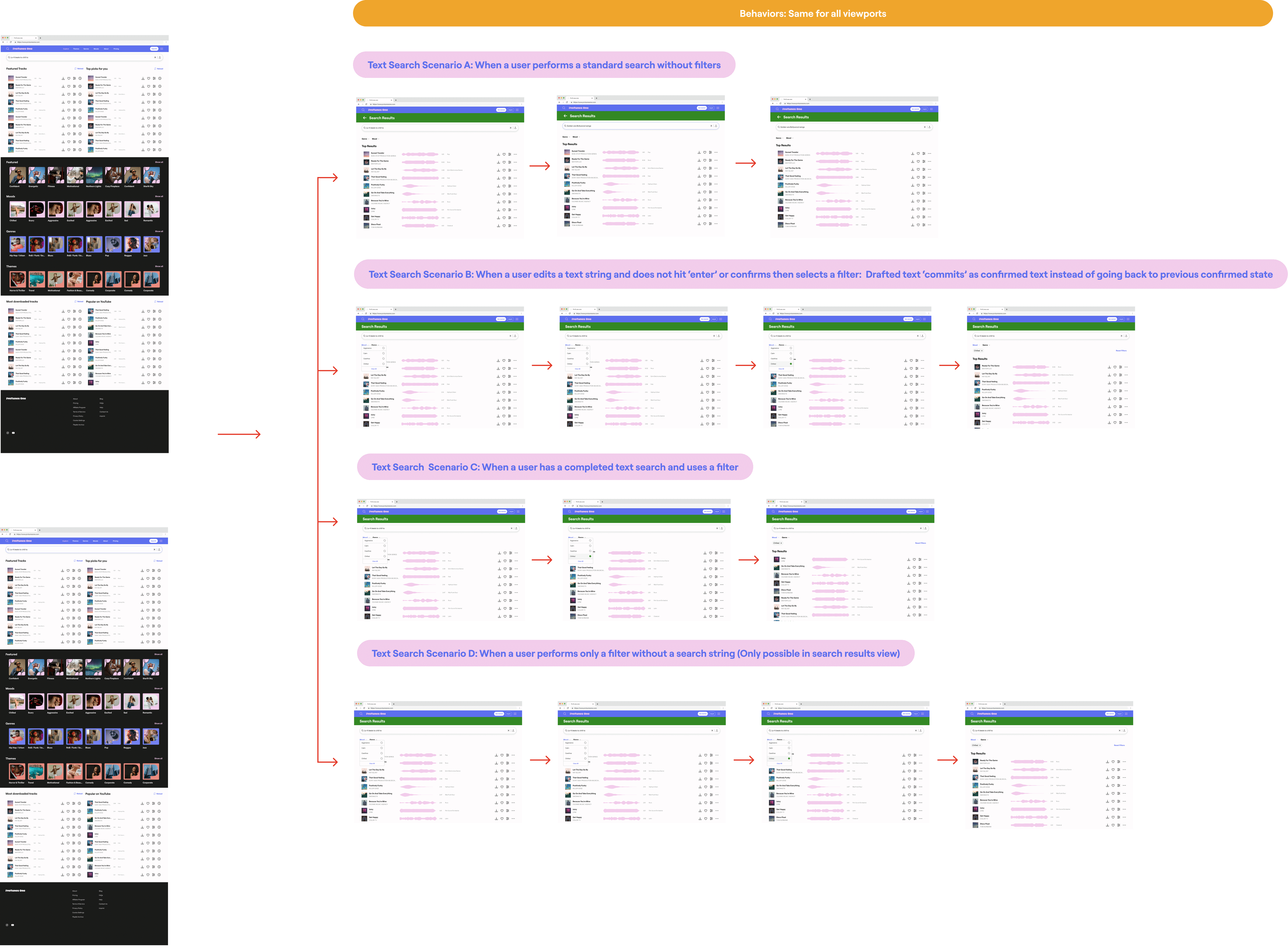
- Semantic Feedback: I designed specific UI patterns for AI search prompts, ensuring users understood how the engine was interpreting their "mood" or "genre" requests.
- Waveform Architecture: We optimized how audio data is visualized, creating a consistent waveform component that works seamlessly across mobile and desktop, allowing for precise track scrubbing and selection.
The Content:The launch of the ProTunes One Design System transformed our internal workflow and the end-user experience:
- 50% Faster Handoff: Reduced design-to-development time by standardizing components and documentation.
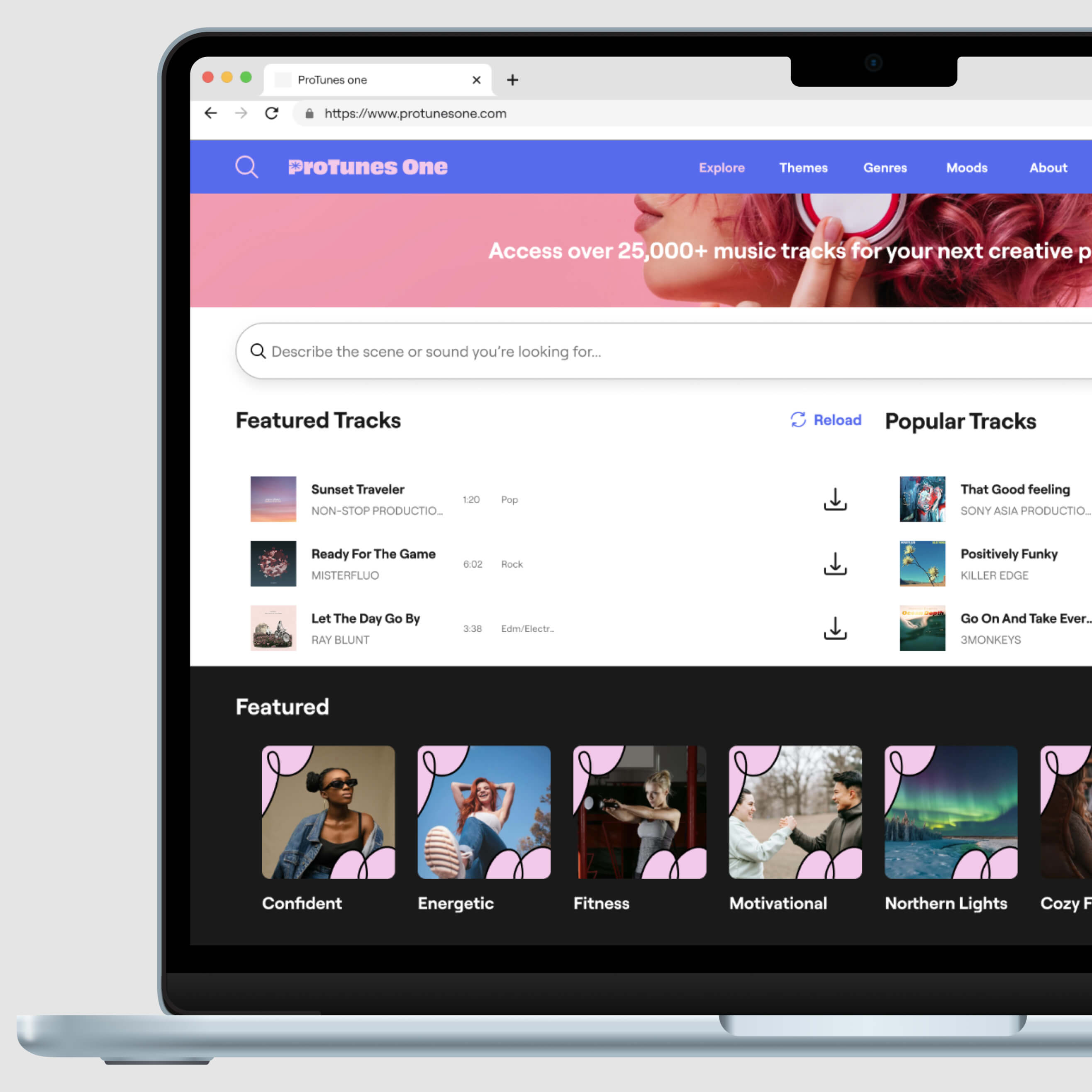
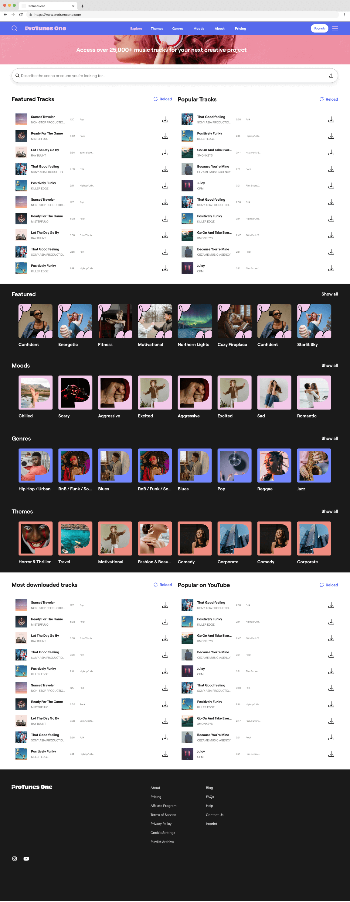
- Unified Identity: Achieved 100% visual parity between the marketing site and the core product platform.
- Scalability: The system now supports the integration of new AI features in days rather than weeks, providing a future-proof foundation for the ProTunes ecosystem.
Component Set Organization
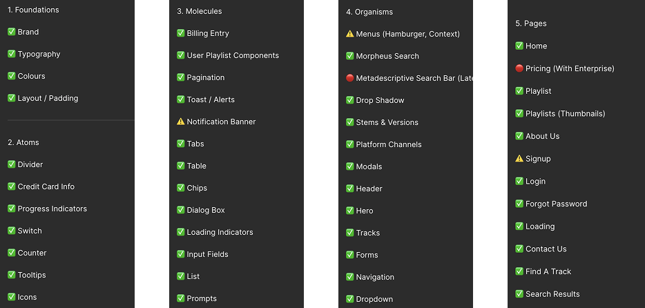
Foundational Components
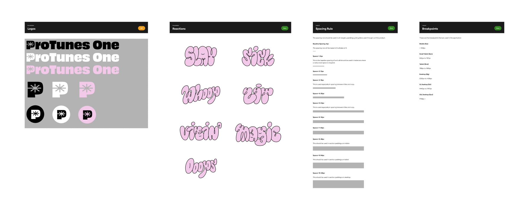
The Foundations of the ProTunes One Design System establish the essential, abstract building blocks that define our brand and user experience. This includes our Colour palette, which is rigorously structured to manage brand identity, utility, and visual contrast. Typography sets the visual hierarchy and ensures readability through designated weights (Heavy, Bold, Regular) and usage rules. Brand consistency is maintained via strict guidelines for Logos and their variations. The system's tone is captured by Reactions, setting an expressive and energetic style for microcopy and system feedback. Finally, predictable and clean layouts are ensured by defining consistent Spacing for rhythm and harmony, alongside explicit Breakpoints that guarantee a truly responsive experience across every device.
Atoms
Molecules
Organisms
.png)

Pages (For main product page structure, excluding flows)
Example Flows
Other Projects


rückla
A speculative digital banking app focused on intuitive financial management. Developed the full UX framework with user research and high-fidelity prototype.
ecolytiq
A sustainability-as-a-service provider for global banking institutions. Designed customized whitelabel UX flows for Tier-1 Fintech clients including HSBC and Visa, reaching over 50 million users.